Creating a Walk Cycle | Development

Following from rigging my character, I continued to use Sebastian Lague’s tutorial on Character Creation to create a walk cycle for my character to follow. Sebastian’s tutorial includes a step-by-step tutorial, putting the simple mechanisms of key framing and using the dope sheet into practice.

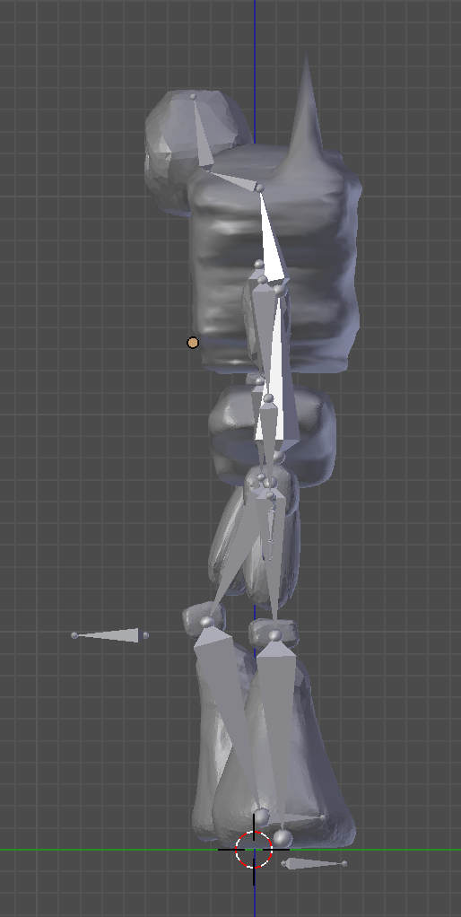
The first thing I tackled was animating the movement of my mesh in one spot. Once I had completed my mesh, armature and all, I set about creating key frames beginning with the 1st frame and ending with the 8th. I moved the armature to create the following poses.

Frame 1:

Screen Shot 2017-12-14 at 10.58.25

Frame 8:


Screen Shot 2017-12-14 at 11.03.55

After doing so, I duplicated and reversed frame 1, placing it at frame 16 using the shift+ctrl+V shortcut. I then changed the interpolation to constant to gain a static view of the poses at each keyframe, helping me to block out a more accurate animation. Now I needed to repeat the reverse duplication, but this time of frame 1 and frame 8. I decided against adding any more keyframes than the amount I already had per walk cycle, as the result I gained from this created a smooth and consistent animation. My model is a creature made of rock, so too much movement would break away from his reality. Once I was happy with the animation, all the was left to do now was create a path for the animation to follow.

Here was the result:

Creating a Path:

To create a path, I first opened an NLA Editor window and opened the animation for my Armature and set the repeat option under Playback Settings to a large enough number to cover the number of frames I wanted in my final animation. Adding a new path under the mesh option curve, I lengthened it to the desired size and parented the armature to the Path Constraint. I needed to alter the position of my model before moving along, so did so and made sure it was facing the direction of the path.

Under the constraints tab on the right-hand toolbar, I clicked on ‘Animate path’ and ticked ‘Follow curve’, which caused my model to walk along the path I had created.

I then moved on to composting this animation onto my final image. Find a time-lapse in the post I dedicated to my final animation.
Preparing My Model For Substance Painter | Development

On deciding to texture paint my model in Substance painter, I now needed to prepare the model to be imported into the software. To do so, I needed to UV unwrap and export the model as a .obj file.

Because I had never used Substance Painter to texture paint such a complex model, I consulted my tutor and asked him what the quickest and most efficient way to go about it would be. I had looked at tutorials in order to try and work out how to do it through my own primary research, however the tutorials I found focused on simpler meshes and failed to help me much. Here are some examples of the tutorials I originally relied on.

My Experiments:

After struggling for a few days, I had a meeting with my tutor who created the following walkthrough. In the walkthrough, I was able to see first hand how to export appropriately. My tutor showed me how to do so with one part of my model so that I could apply it to the rest. Because I was present, I could ask questions about things I had experienced in my previous experiment. The following footage is of this meeting.

UV Unwrapping my Model:

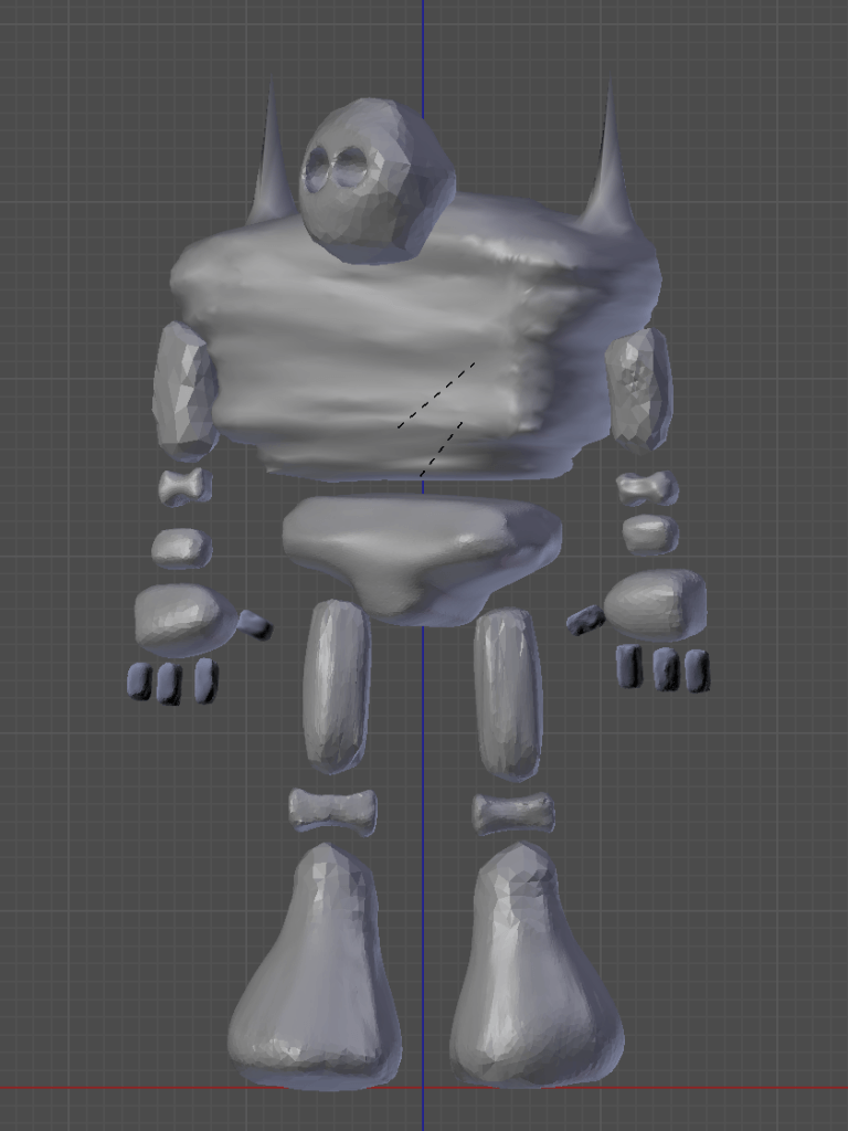
After this tutorial, I proceeded to apply what I had learnt to the rest of my model Originally, I did so to each individual part of my model. After doing so, I imported them into Substance painter, baked the textures and went to work designing how I wanted them to look. Here is the outcome of this part of my development:

As I began texture painting, I started to question whether doing every separate part of my model individually was necessary. Before I went any further, I went back to my model and exported the pose with each individual part of the model joined together, making one large mesh. I then UV unwrapped the model as this and took to texture painting it. The result satisfactory, so I proceeded to export each pose as one mesh before importing them into Substance Painter.

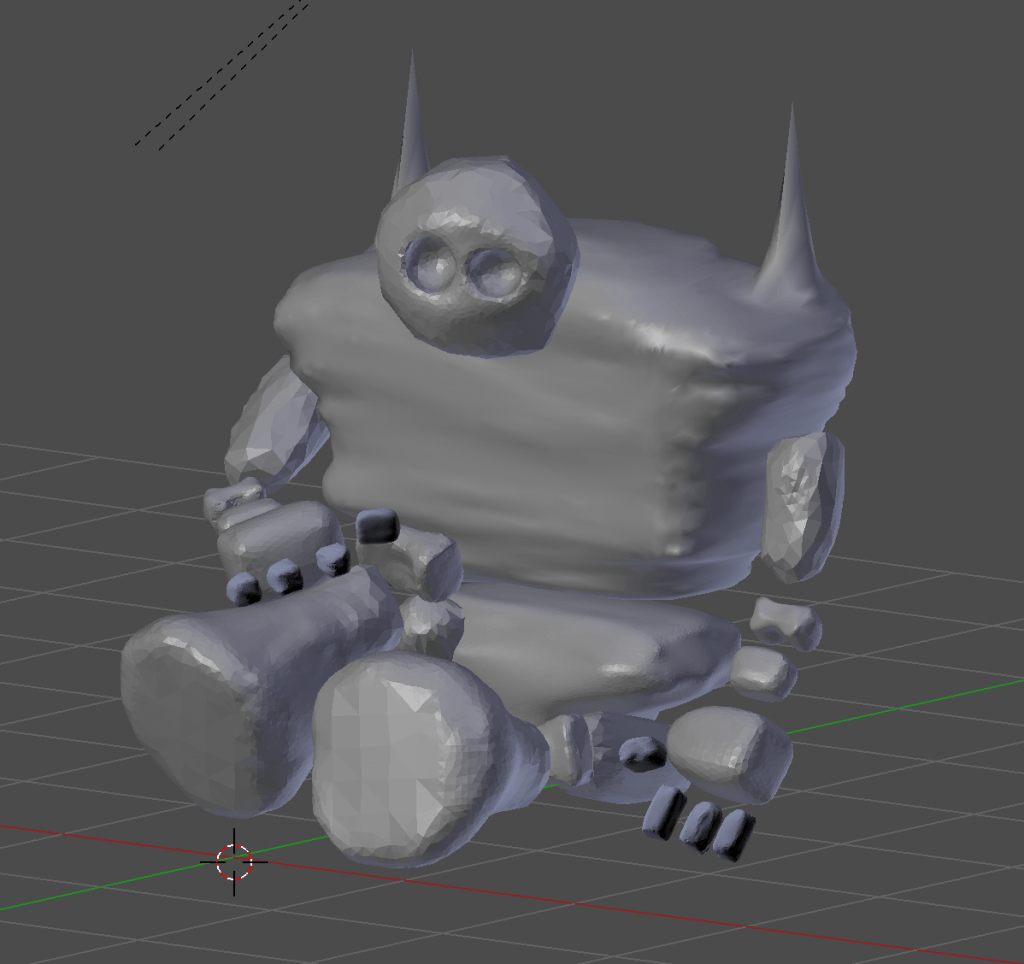
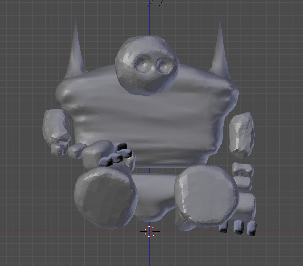
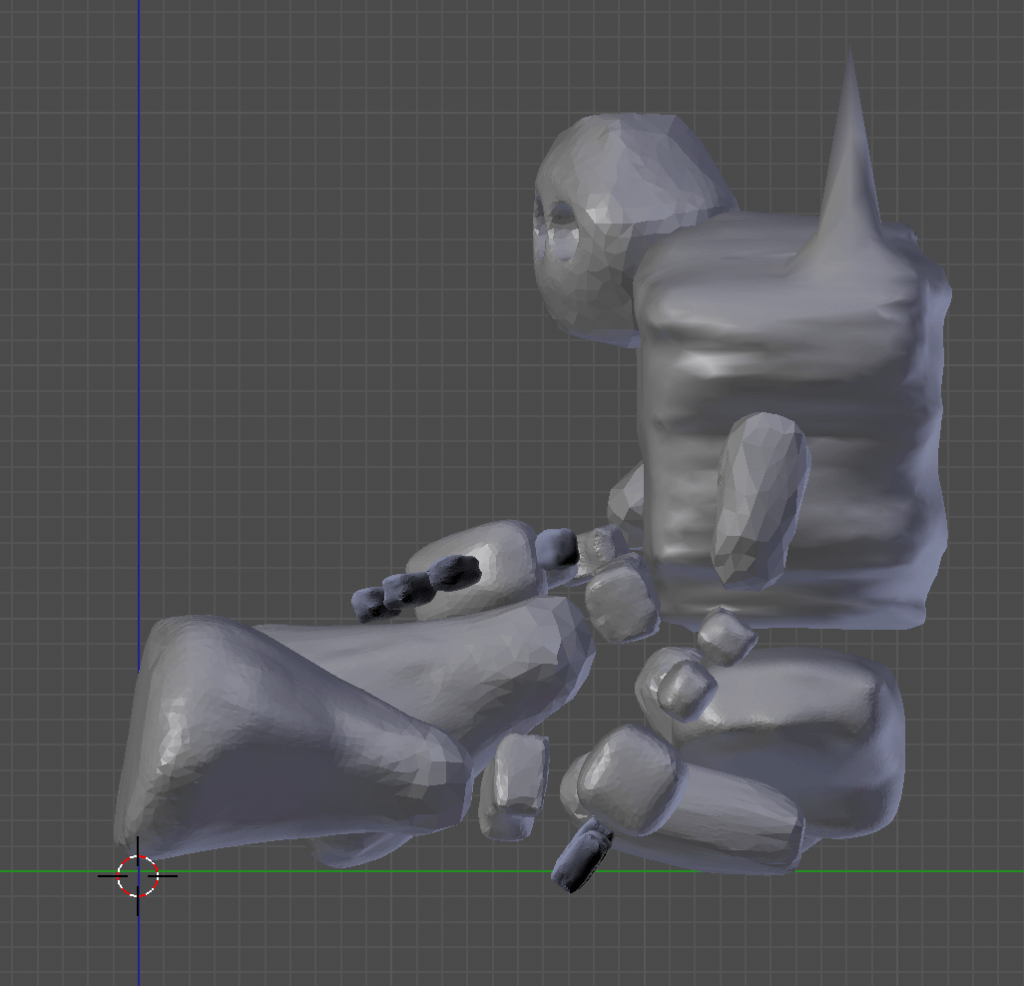
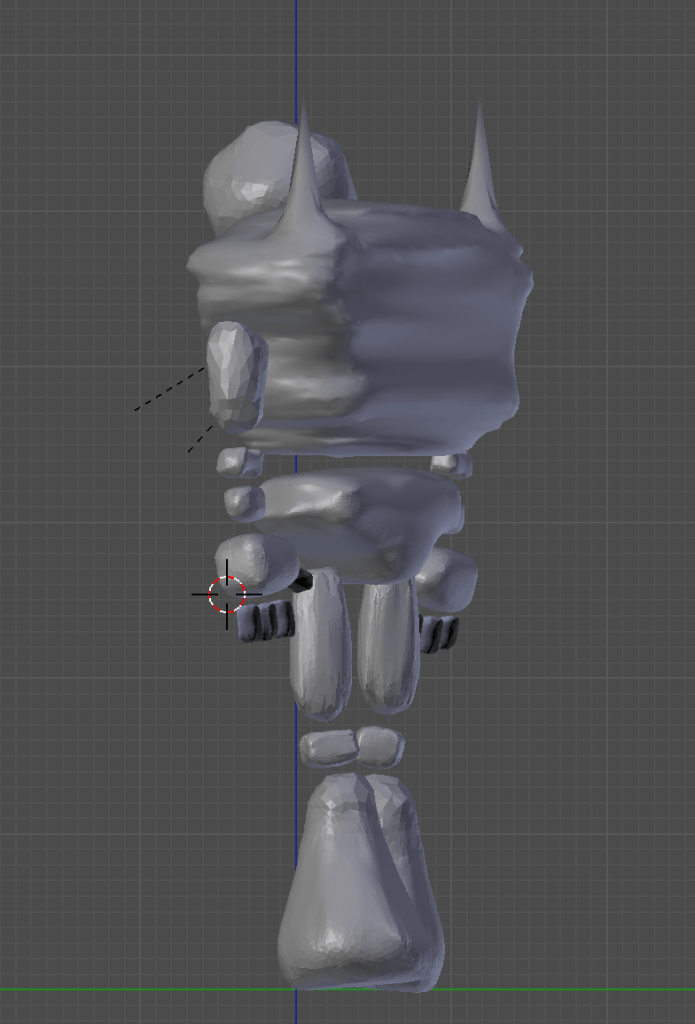
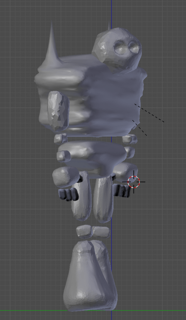
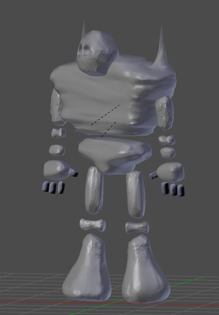
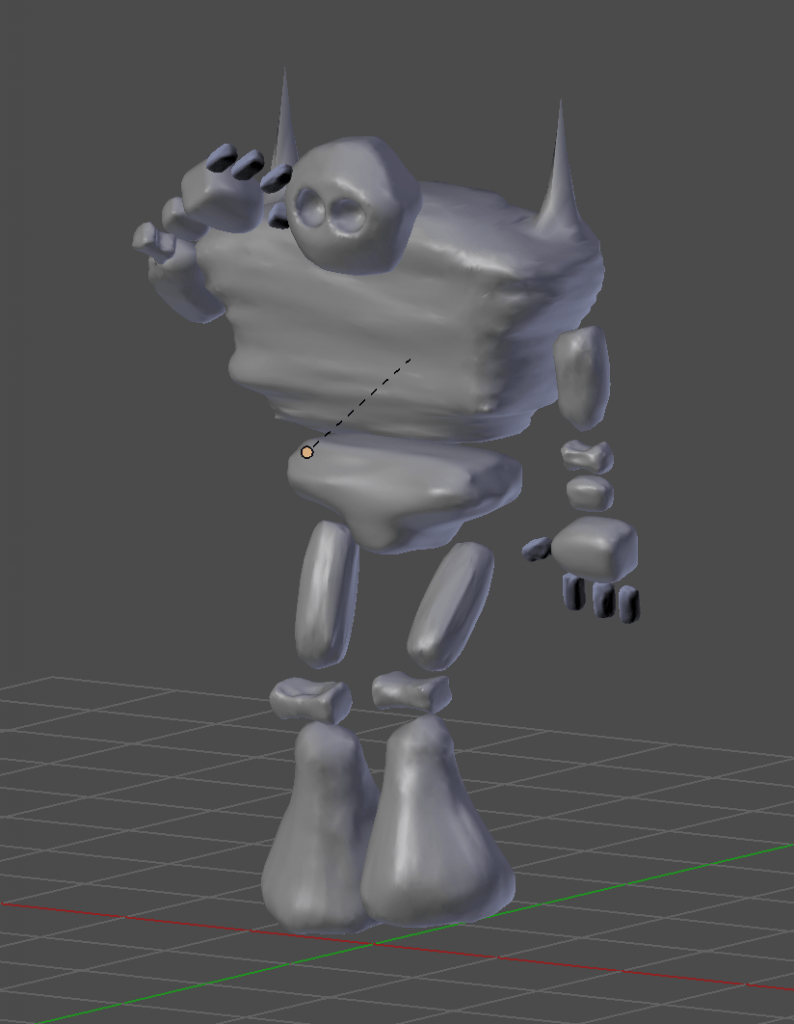
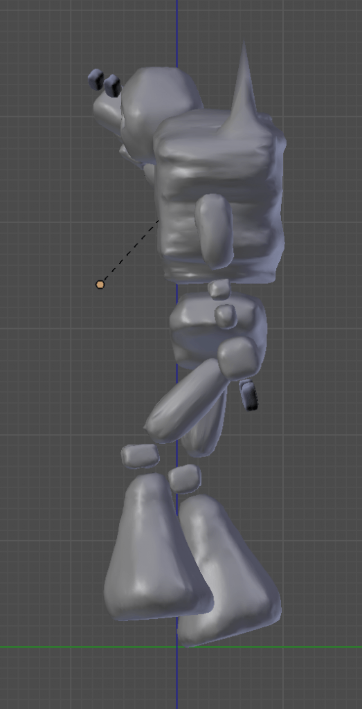
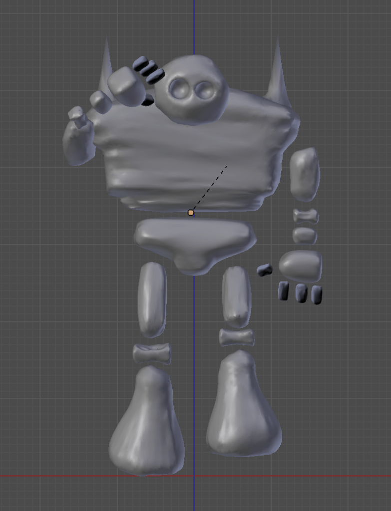
For the model I wanted to animate, I exported the pose as below ready for texture painting.

Posing my Creature | Development

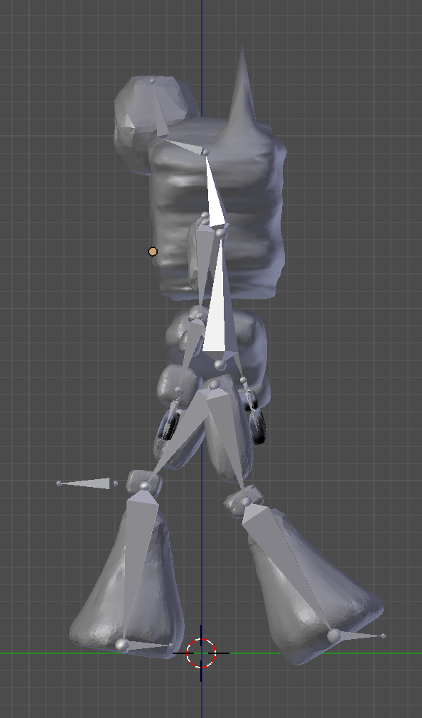
After adding a skeleton and parenting my mesh to the armature, I positioned the creature in appropriate ways to match the final images I had chosen. To position them, I simply moved the different bone in my creature to place them where I saw fit.

Image 1 – Snow

[Image Credit: Cristiana Bardeanu – Snow – Link]

For the snowy image, I chose to place my creature in a relaxed pose. There is an empty place in this image where I feel he would fit perfectly, but because there is little to look at in this image, a simple pose seemed appropriate. This pose also gives me the opportunity to explore more when texture painting this model, as his lack of movement would most likely cause a thin layer of snow to cover the top parts of his body.

Pose:

Pose 1 - 1 Pose 1 - 2 Pose 1 - 3

Image 2 – Forest

[Image Credit: Free-Photos – Trees – Link]

For the second image, I chose to place my creature in a pose that suggested wonder. As this scene is set in the middle of a wood, there is not much for him to see apart from a large amount of foliage, therefore there isn’t one specific place for him to be looking. The nature of my creature forces him to evolve depending on where he is, so making him stand tall is a must, as it would better resemble the scenery around him, and help him to blend into the scene. This all lead me to the following simple pose.

Pose:

Pose 2 - 1 Pose 2 - 2 Pose 2 - 3 Pose 2 - 4

Image 3- Sea

Sunset


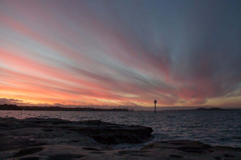
[Image Credit: Andym5855 – Sunset – Link]

For the final image, I chose to have my creature look out on the horizon. This seemed fitting for this scene as not only is the sunset fading the light, but it is common for people to visit the sea and do such a thing. When looking across a large distance, it can be hard to see, so including a hand gesture that shows viewers that my creature is trying to admire his surroundings seems very fitting. I also wanted to imply movement in order to bring my model to life and present him as something other than a static figure. To imply this, I presented him in mid-walk.

Pose:

Pose 3 - 3 Pose 3 - 2 Pose 3 - 1

The following is a time-lapse of how I created the first pose, the same principles were applied across each different outcome:

I originally tried to create this pose before I chose to simplify the armature and remove the bones from my creature. This is the result, one I was not happy with. It is because of this I decided to stick with the simplified armature as opposed to creating a more complex one to incorporate the finger bones. The final poses I created didn’t need such a complex armature. It was during the posing of my creature that minor armature errors became apparent, causing me to alter specific parts of the mesh and/or bone placement.

Parenting My Model To Armature | Development

Because my character is not human, and his limbs aren’t all attached, I had to alter how and where I placed certain bones in the armature structure.

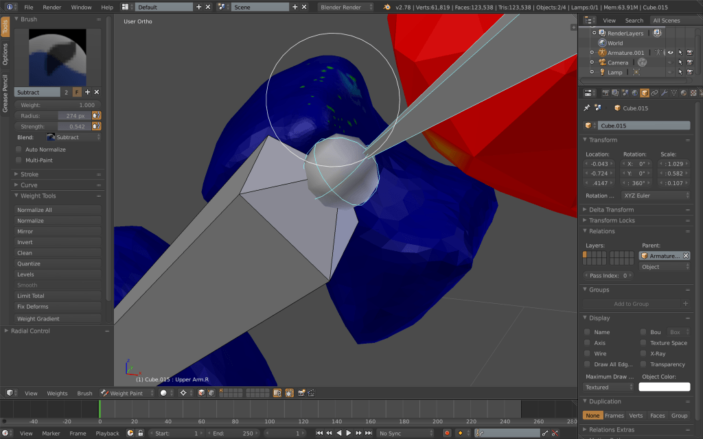
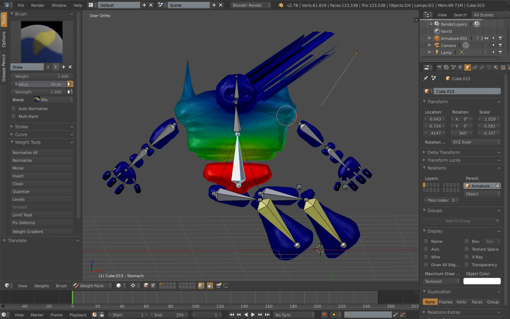
When I originally parented my mesh to its skeleton, I realised that I needed to move the endpoints in the limbs away from the pelvis and shoulders so the joints didn’t bend the mesh. Once I reloaded and reparented the mesh, I individually altered the weight as follows:

– I didn’t alter the Torso and Pelvis’ weight as when I changed the pose of my creature, it seemed to move reasonably well and I didn’t want to risk losing this.

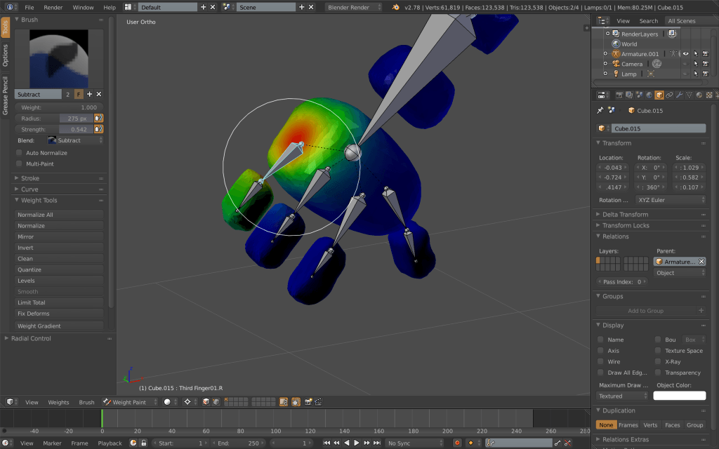
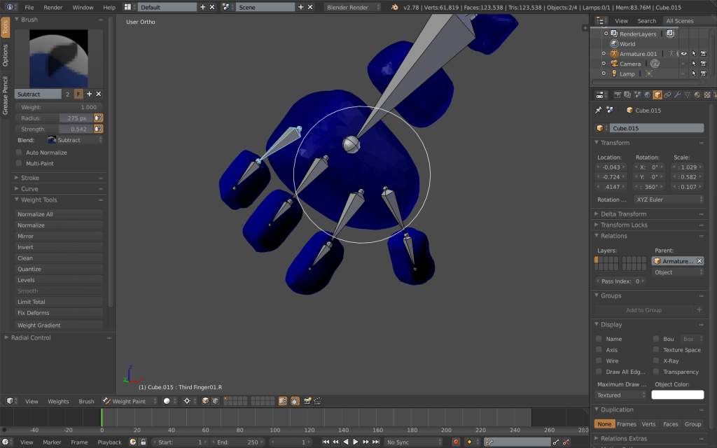
– I made sure the finger bones were unattached from the hand and only weighted the fingers on the second bone, leaving the weight paint empty on the first finger bone.

Weighting 3 Weighting 4

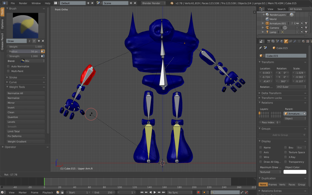
– The lower arm bone is weighted to the elbow and the lower arm, the upper arm bone is attached only to the upper arm of the creature. This does effect the way the arm moves, however the stocky nature of my creatures figure justifies the stiffness in his shoulders.

Weighting 6

– The Neck bone has no weight as my creature does not have a visible neck, therefore it does not effect how the character’s head moves.

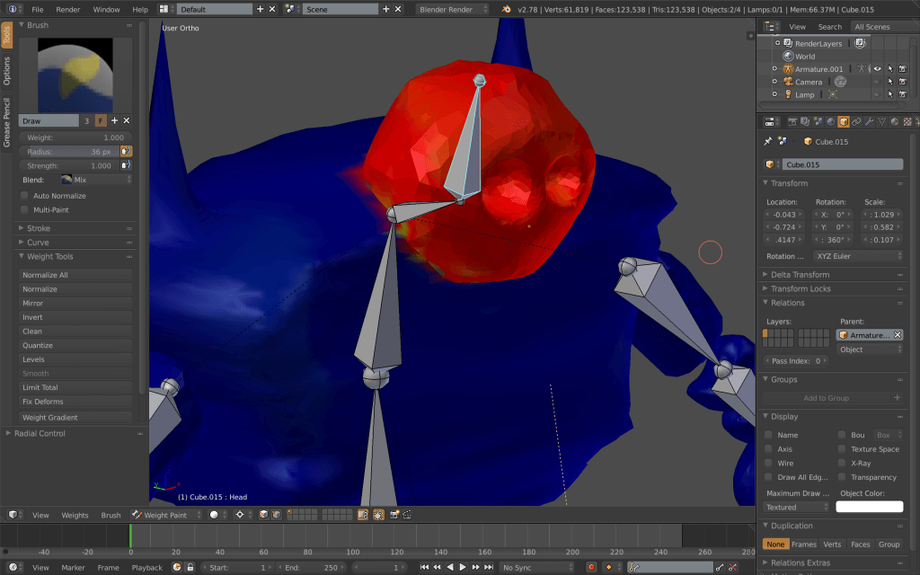
– The head is weighted solely to the head/skull bone. It was hard to be precise when paint selecting the parts of the mesh I wanted to attach to this bone, however I could risk this (again) due to the stiff and stocky nature of my character. I was still as accurate as I could be when using the tool.

Weighting 2

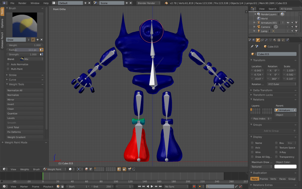
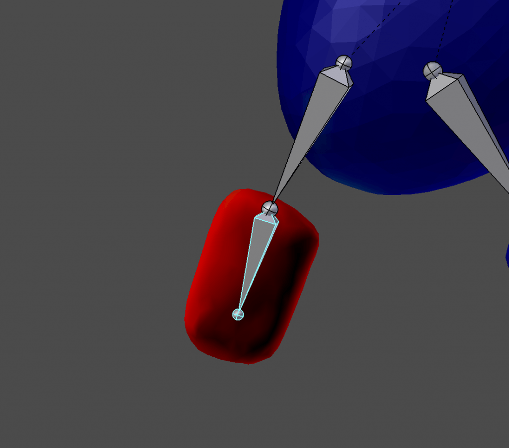
– The lower leg bone includes the mesh of my creatures knee, and the upper part just the top part of the leg. I made sure the knee was strongly connected by painting it until it was all red.

Weighting 1

After I went through and connected each part of my skeleton appropriately, I made sure to move the bone to ensure everything looked and moved nicely. When moving my model, I would sometimes experience weird deformities that made spikes for on my mesh when it moved. I realised that this was due to a mistake when weight painting certain parts of my mesh. To stop this, I checked the way each bone moved every time I painted, and made any appropriate alterations to ensure specks of weight like in the image below were all gone. This is what lead my final weigh paint to be solely Blue or Red.

Weighting 5 Weighting 7

In the end,  I removed the bones I attached to the fingers and kept them static as I was unable to get the fingers to be fully functioning in the way I had hoped. This did not limit my possibility too much, however it did disable the ability to create complex poses. If needed, I would return to my model and add these bones in, making sure they were accurate, however for now, I chose to continue without including this armature.

Weighting Finger 1 Weighting Finger 2

The Final Result: