Blender Tutorials | Research

On doing research into refreshing my memory within Blender, I found a playlist created and uploaded by YouTube user ‘Blender Guru’, in which I was taught everything from how to use the programs interface, to creating visually realistic materials. I decided to follow the first few steps to this tutorial, and recorded my results below.

These tutorials helped to improve my basic skills in the software, and taught me techniques I could use in my final project. I have used Blender before and therefor have a basic understanding of the topics Blender Guru covers in his tutorials, however as time has passed I have become less comfortable with using tools and shortcuts.

Blender Guru Tutorial Playlist

Timelapses:

In the first tutorial, I was getting to grips with the interface of blender and refreshing my knowledge on basic functions such as viewing the mesh I am working on. The majority of this tutorial was focused on a simple fire simulation, which showed me what blender was capable of. This tutorial will make it a lot easier to know what my model looks like from all angles with the simple click of a button. As I will predominantly using my laptop to create my designs, I will need to change the input user settings to emulate the number pad, this isn’t a large problem as the shortcuts tied to the number keys elsewhere on the keyboard will not be used my be.

The second tutorial went into further detail about the functions within blender, experimenting with scaling, moving and rotating the mesh. It also introduced the idea of using the modifier ‘Subdivision surface’ as opposed to altering the mesh permanently at the beginning of your session. There was also a small introduction to the modifier ‘Wave’ that animates your mesh as described.

The third tutorial was almost predominantly about alerting your object in ‘Edit Mode’. This taught me many useful techniques on how to change and deform any object to look like you want it to. As every tutorial has, this one was filled with shortcuts and information about what edit mode can do, making me feel more confident within this software.

I ended my tutorial on the fourth available on Blender Guru’s playlist. The forth tutorial was dedicated to working with material nodes, and how to make an object appear to be more realistic, with tips and tricks on using the nodes appropriately.
Tomislav Jagnjic | Research Agenda

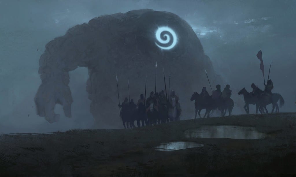
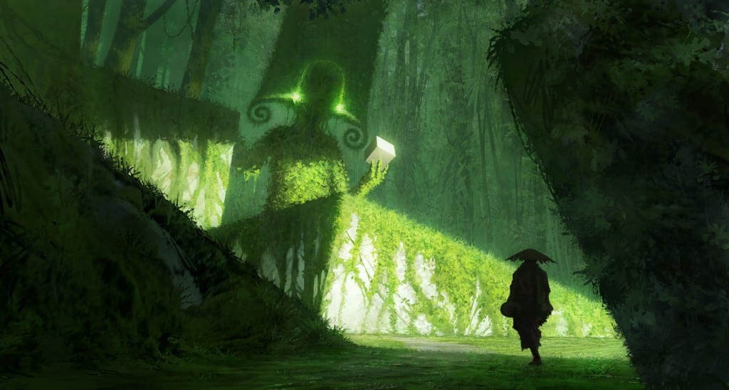
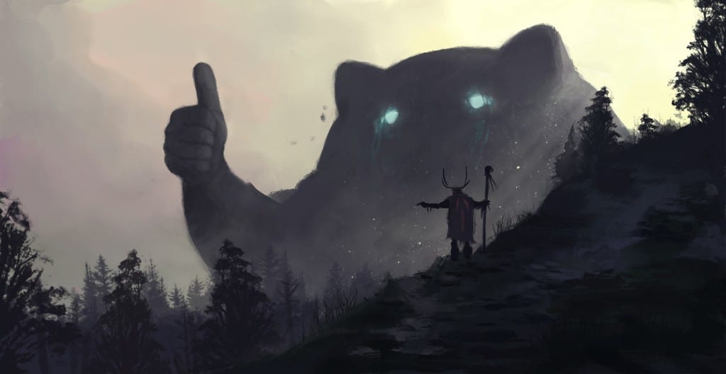
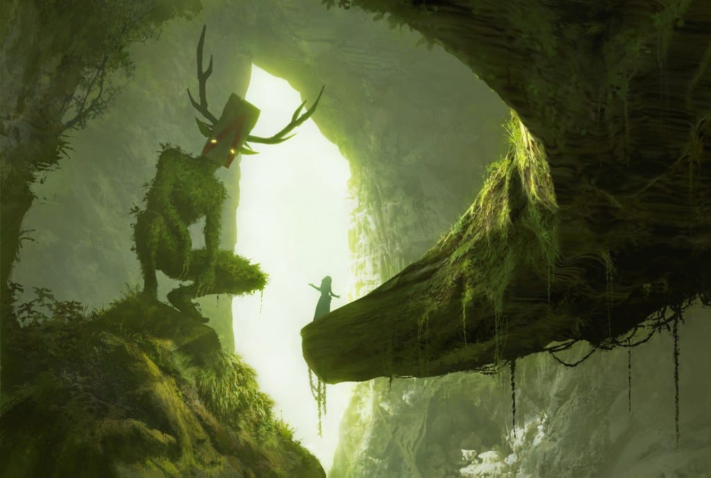
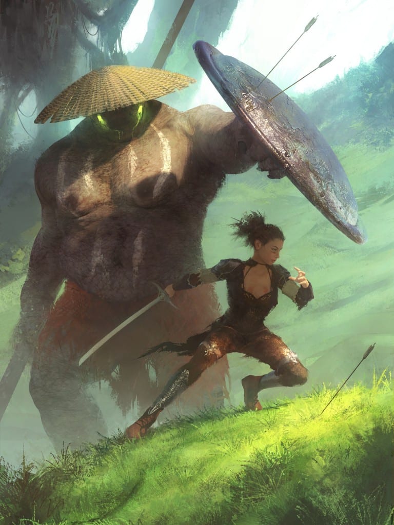
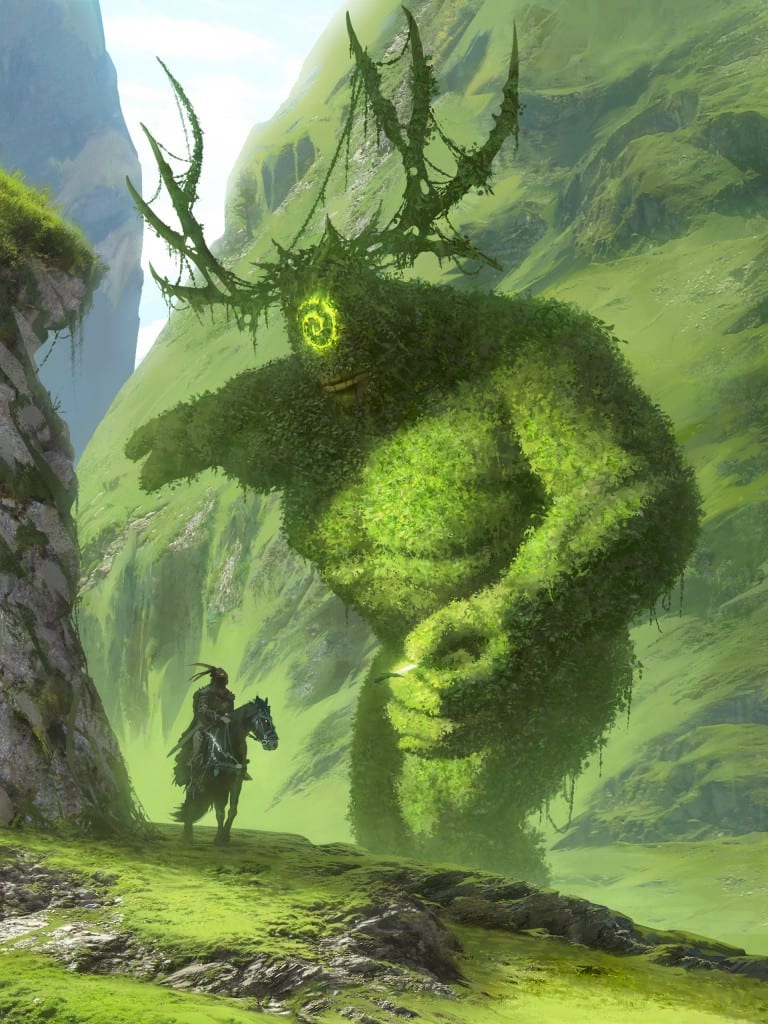
I have recently discovered a concept artist who has created images that slightly resembles elements of my project proposal. Whilst browsing the internet, I came across Tomislav Jagnjic, a concept artist & illustrator from Montenegro. On his portfolio, he has created a series of quirky creatures that resemble the environment they live in somewhat, and interact with other characters and people. These quirky characters have equally quirky and comical names to go with the composition.

‘Cover me’ [below left] & ‘Dude is this yours, I think you’ve dropped it back over there’ [below right]

Cover me dude is this yours, I think you've dropped it back over there

  ‘Nope, wrong way. turn around’

nope, wrong way. turn around


‘Hey psst, wanna buy some cubes’

hey psst, wanna buy some cubes

‘Yo bro is it safe down there in the woods? yeah man it’s cool’

yo bro is it safe down there in the woods? yeah man it's cool

‘How do you mean you don’t wanna go outside?’

How do you mean you don't wanna go outside?

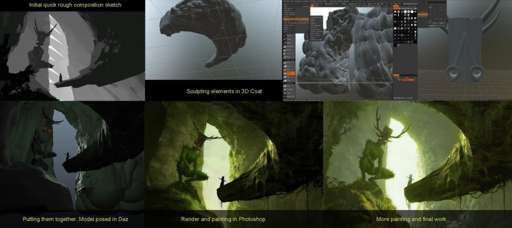
While some of these designs are solely illustrations, the above piece “How do you mean you don’t wanna go outside?” included the following workflow, which briefly shows how the artist went from initial sketch to final project.

tomislav-jagnjic-5stx9kt


Click here to look at his portfolio

Why Blender? Blender vs Maya | Research

Before dedicating to my project and beginning the modelling process, I needed to find the right software for the task. In order to do so, I needed to consider what elements I would need to create my final project, and then experiment within appropriate software to see what they have to offer, as well as which one I felt more comfortable working in.

What do I need?:

  • 3D modelling
  • 3D Animation
  • 3D Rendering

Maya

‘Maya® 3D animation, modelling, simulation and rendering software provides an integrated, powerful toolset. Use it for animation, environments, motion graphics, virtual reality and character creation.’

Pros:

  1. Versatile. Maya developers are and have been constantly developing and improving the software since it was acquired by Autodesk back in 2006.
  2. Industry standard. Framestore and Moving Picture Company collaborated on two key characters from this summer’s blockbuster hit Guardians of the Galaxy. The software has also been used in films including Transformers, Pacific Rim, Wreck It Ralph, The Hobbit, and the first 3D version of the classic Charles Shulz’ comic Peanuts.
  3. Skills can be used in other software. When you learn a complex software like Maya, you are building the skill of learning how to use a new type of tool. In this case, you’re learning how to use 3D animation software. [REFERENCE http://blog.animationmentor.com/5-reasons-why-3d-animators-should-know-autodesk-maya/]

Cons:

  1. Unorganised. The interface of Maya is rather complicated compared to Blender.
  2. Expensive. Although I have a student licence that allows me access to the software for free, using this software after my university degree would come to a pricey total, costing almost £1,700 a year!
  3. Complicated to learn. Compared to other software, Maya is very difficult to navigate and use.

Blender

‘Blender is the free and open source 3D creation suite. It supports the entirety of the 3D pipeline—modeling, rigging, animation, simulation, rendering, compositing and motion tracking, even video editing and game creation.’

Pros:

  1. Free. Blender is licensed under the GPL.
  2. Powerful. Runs on many Platforms. You don’t have to worry about what computer you are working on.
  3. Python Extensibility. Blender embeds Python 3, which can be used to write add-ons, tools, extend the interface, rig characters and automate tasks.
  4. Sculpting. Although blenders 3d painting and sculpting tools are not specialised like Substance painter, it is more than capable of getting most jobs done with a lot of practice and time taken to understand it’s capabilities.
  5. Rendering. Blender runs the Cycles path tracing engine under the hood. Cycles is a very powerful rendering engine capable of full path tracing.

Cons:

  1. Mouse. Some of the short cut functions are made a lot easier with a middle mouse button or a mouse wheel, so you will need to buy one of these.
  2. Viewport performance. Slow viewport performance with high-poly scenes.


Sources:

– Animation Mentor Blog. (2017). 5 Reasons Why 3D Animators Should Know Autodesk Maya ®. [online] Available at: http://blog.animationmentor.com/5-reasons-why-3d-animators-should-know-autodesk-maya/ [Accessed 15 Oct. 2017].

– Autodesk.co.uk. (2017). Maya | Computer Animation & Modelling Software | Autodesk. [online] Available at: https://www.autodesk.co.uk/products/maya/overview [Accessed 15 Oct. 2017].

– Foundation, B. (2017). blender.org – Home of the Blender project – Free and Open 3D Creation Software. [online] blender.org. Available at: https://www.blender.org [Accessed 15 Oct. 2017].

– Pluralsight.com. (2017). Where Blender Functionality is Better Than Maya’s. [online] Available at: https://www.pluralsight.com/blog/film-games/where-blender-functionality-is-better-than-mayas [Accessed 15 Oct. 2017].

– Quora. (2017). What are Blender 3D’s pros and cons?. [online] Available at: https://www.quora.com/What-are-Blender-3D’s-pros-and-cons [Accessed 15 Oct. 2017].

Creature Design in 2D | Development

Before I could begin creating any models in a 3D modelling software, I needed to have an idea of the starring creature in my project would look like. To do this, I began to sketch out ideas on paper and confirm the initial anatomy of the character.

Inspiration

Looking to inspiration, a key influence was a character from a video game I played as a child. In the original Rayman 2 game, the key antagonists are an army of Robo-Pirates lead by one Admiral Razorhead. Although these robots-pirates are mean enemies of the protagonist, as a child I used to play as this character in the following Rayman racing game Rayman M, where all characters were equal.

300px-Piratehenchman_800_by_deathtosquishies

Robo-pirates have a large torso made of metal, with large limbs made of different components, one a gun and the other a hook. His head looks to be like a knights helmet, rounded at the top and pointed at the chin. This creature is made out of metal, something that isn’t found in the natural environment, however its short stocky figure and their reaction to their surroundings does add an element of simplemindedness, making an almost childlike innocence.

Another inspiration to help me begin to design my final creature came from a Studio Ghibli design. The spirits in the film ‘Princess Mononoke’ have a minor role, however, their charming faces and small size made them an instantly recognisable part of the film. Their motif is simple, the spirits are white bodied, with slightly human-like features. They have two arms, two legs, two eyes, (some have) a nose and a mouth.

giphy

What inspired me about these characters was their emotionless faces. Their face consists of 3 to 4 circles, all varying in size, that bare no resemblance to any particular creature. This design adds innocence to their otherwise simple character design.

Beginning my design process

First off, I wanted to establish the size difference between the head and the torso of my creature. Once deciding this, I began the initial design of the body, experimenting with different shapes.

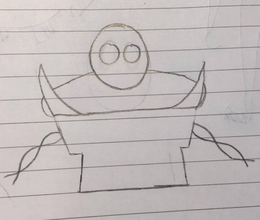
23030491_2102365009994558_1379025096_o

The above was the first sketch I made. I began by outlining a simple robo-pirate like shape and added on spikes to add an originality. During this time, I also experimented with how the limbs of the character would be attached to the main part of its body, and I initially wanted to use a vine-like system.

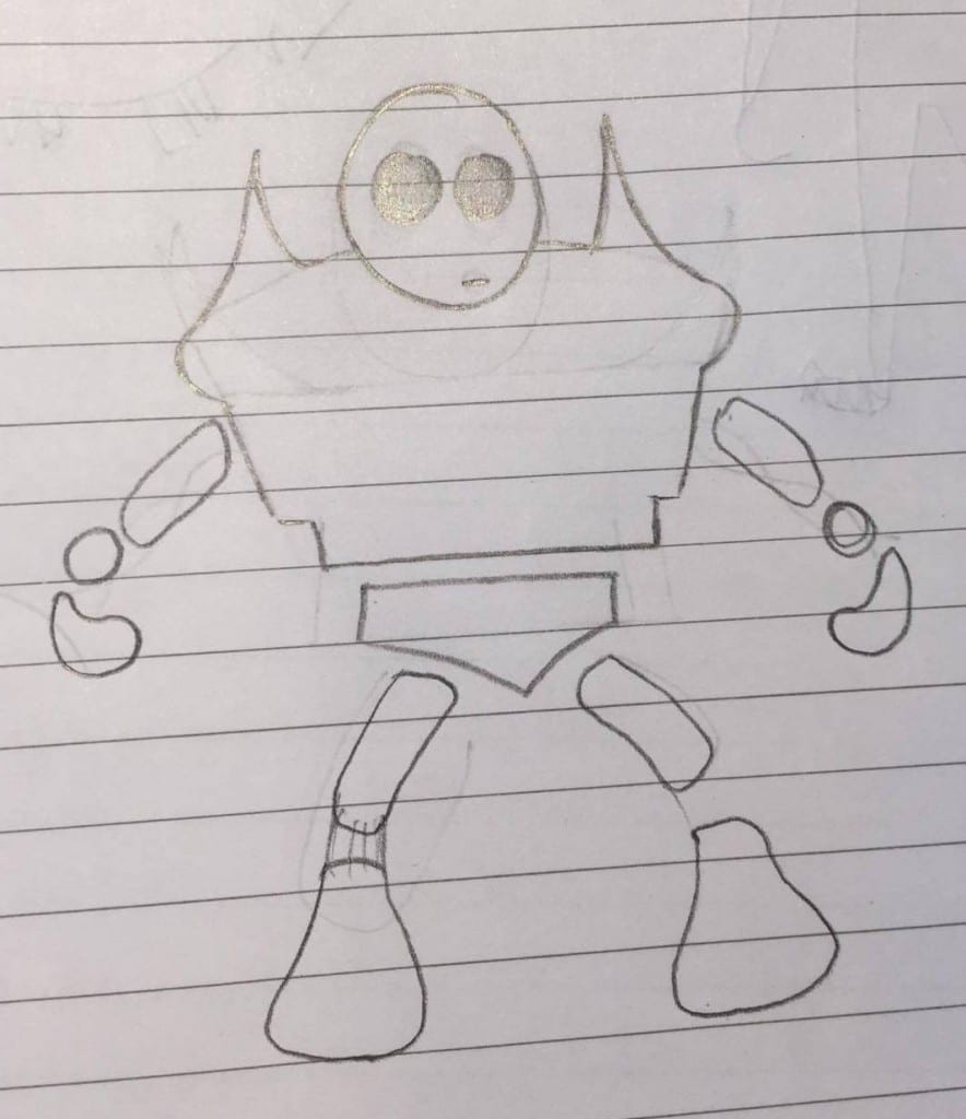
23023387_2102364993327893_394093021_o23030805_2102364996661226_577329455_o

After the initial, I drew two different sketches, one with a basic shape, the other with added spikes to the shoulders. Because I wanted to include more elements of the character that could be incorporated into the multiple backgrounds I intend to place it in. Adding the spikes means they may be susceptible to things the environments may be filled with, examples being caught in trees and vines, sticking out behind mountains, or even just having wildlife climb and settle in between them.

When sketching these two designs, I also chose to taper the bottom of the body, having its groin shapes like a typical pelvis, and the above torso slowly decreases to a lesser point.

23107553_2102365003327892_585387167_o

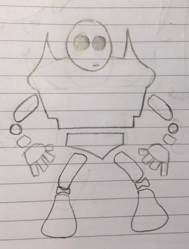
The next thing I needed to design is the limbs and accents of the character. To begin, I sketched simple anatomy fundamentals that fit the body of this creature. I initially intended to develop each limb further, but as I was developing certain parts, it became clear that the simple design I had already created worked extremely well. The feet of the character tapered at the top and became thick at the bottom, making it easy to blend with the group it stood on, and the thin legs seemed appropriate to make sure it doesn’t stand out further.

The arms began similarly to the legs, having a thin upper arm with a joint between that and the hand. When designing the hand, I began to make it rather small as well but felt this lost the human-like features I had hoped to create in order to make viewers experience empathy. Because of this, I added fingers and a thumb to the creature and enlarged them to keep in proportion with the feet.

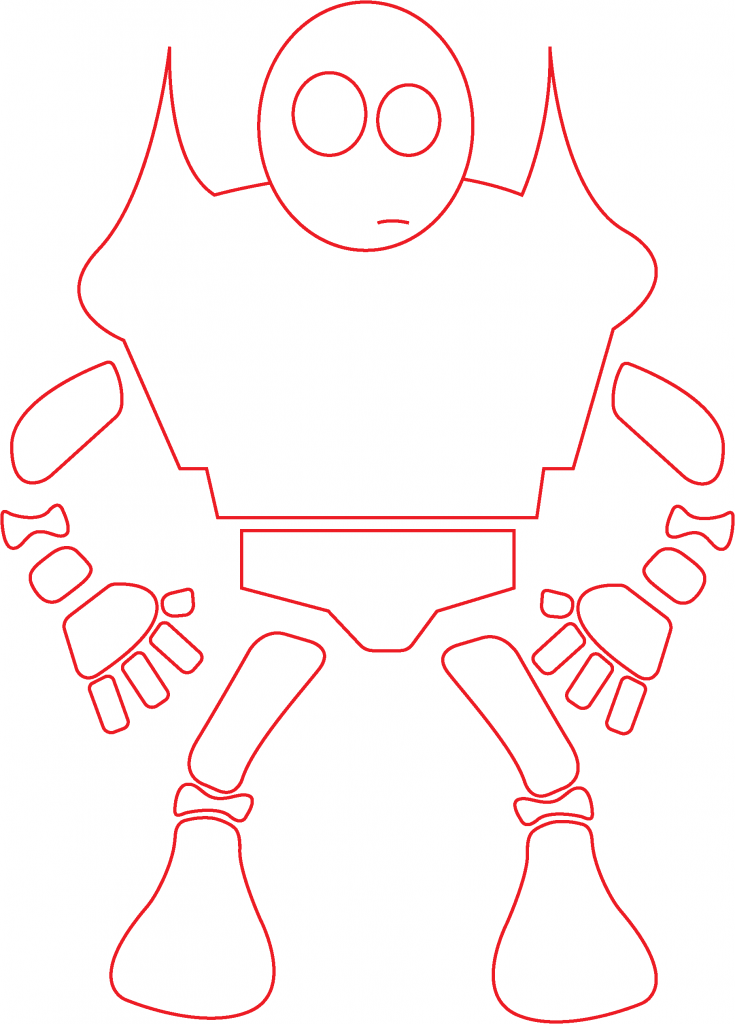
FINAL DESIGN

23030470_2102364986661227_1611102765_o

In the final design, I chose to add joints between the legs, for added realism, and also added a lower arm for practical mobility. Between the joints, in order for them to seem attached, I decided to leave blank, drawing them apart from each other for modelling purposes. This meant I could design each element whilst isolated, placing them relatively close to each other to insinuate they are attached.