Creature Design in 2D | Development
Before I could begin creating any models in a 3D modelling software, I needed to have an idea of the starring creature in my project would look like. To do this, I began to sketch out ideas on paper and confirm the initial anatomy of the character.
Inspiration
Looking to inspiration, a key influence was a character from a video game I played as a child. In the original Rayman 2 game, the key antagonists are an army of Robo-Pirates lead by one Admiral Razorhead. Although these robots-pirates are mean enemies of the protagonist, as a child I used to play as this character in the following Rayman racing game Rayman M, where all characters were equal.
Robo-pirates have a large torso made of metal, with large limbs made of different components, one a gun and the other a hook. His head looks to be like a knights helmet, rounded at the top and pointed at the chin. This creature is made out of metal, something that isn’t found in the natural environment, however its short stocky figure and their reaction to their surroundings does add an element of simplemindedness, making an almost childlike innocence.
Another inspiration to help me begin to design my final creature came from a Studio Ghibli design. The spirits in the film ‘Princess Mononoke’ have a minor role, however, their charming faces and small size made them an instantly recognisable part of the film. Their motif is simple, the spirits are white bodied, with slightly human-like features. They have two arms, two legs, two eyes, (some have) a nose and a mouth.
What inspired me about these characters was their emotionless faces. Their face consists of 3 to 4 circles, all varying in size, that bare no resemblance to any particular creature. This design adds innocence to their otherwise simple character design.
Beginning my design process
First off, I wanted to establish the size difference between the head and the torso of my creature. Once deciding this, I began the initial design of the body, experimenting with different shapes.
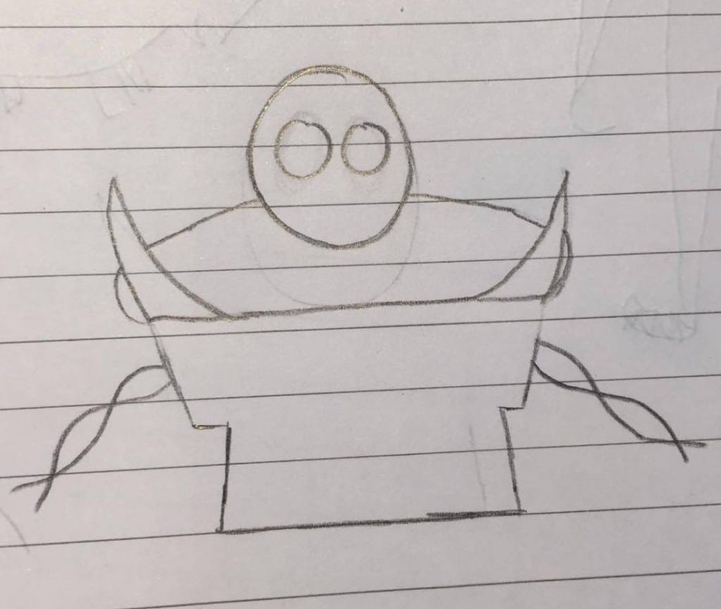
The above was the first sketch I made. I began by outlining a simple robo-pirate like shape and added on spikes to add an originality. During this time, I also experimented with how the limbs of the character would be attached to the main part of its body, and I initially wanted to use a vine-like system.
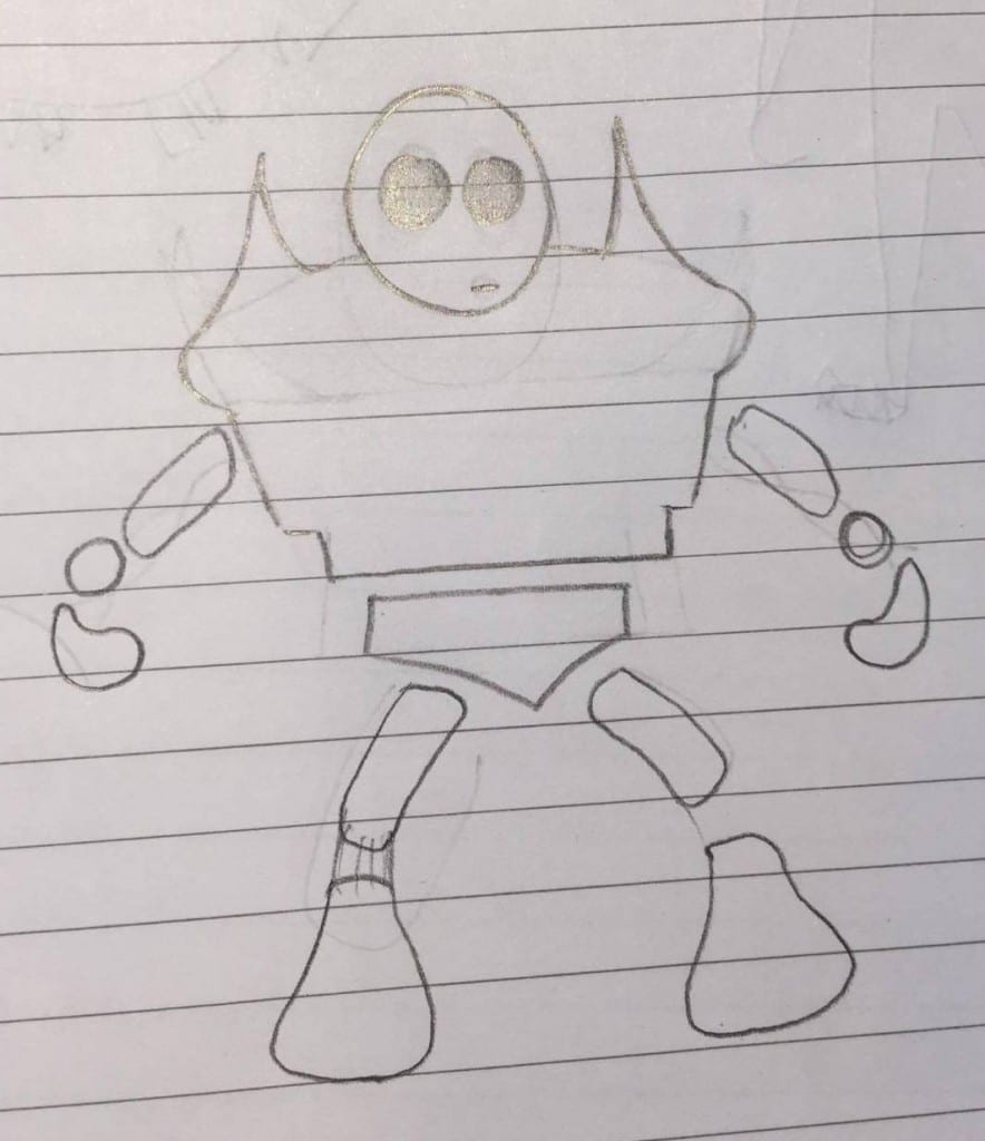
After the initial, I drew two different sketches, one with a basic shape, the other with added spikes to the shoulders. Because I wanted to include more elements of the character that could be incorporated into the multiple backgrounds I intend to place it in. Adding the spikes means they may be susceptible to things the environments may be filled with, examples being caught in trees and vines, sticking out behind mountains, or even just having wildlife climb and settle in between them.
When sketching these two designs, I also chose to taper the bottom of the body, having its groin shapes like a typical pelvis, and the above torso slowly decreases to a lesser point.
The next thing I needed to design is the limbs and accents of the character. To begin, I sketched simple anatomy fundamentals that fit the body of this creature. I initially intended to develop each limb further, but as I was developing certain parts, it became clear that the simple design I had already created worked extremely well. The feet of the character tapered at the top and became thick at the bottom, making it easy to blend with the group it stood on, and the thin legs seemed appropriate to make sure it doesn’t stand out further.
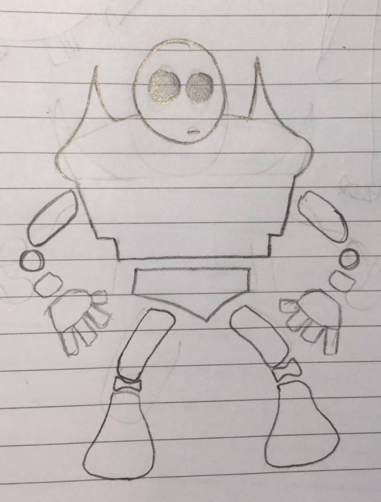
The arms began similarly to the legs, having a thin upper arm with a joint between that and the hand. When designing the hand, I began to make it rather small as well but felt this lost the human-like features I had hoped to create in order to make viewers experience empathy. Because of this, I added fingers and a thumb to the creature and enlarged them to keep in proportion with the feet.
FINAL DESIGN
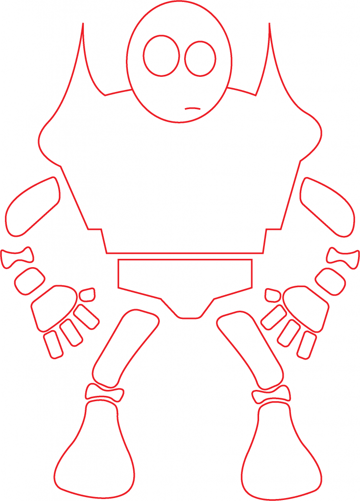
In the final design, I chose to add joints between the legs, for added realism, and also added a lower arm for practical mobility. Between the joints, in order for them to seem attached, I decided to leave blank, drawing them apart from each other for modelling purposes. This meant I could design each element whilst isolated, placing them relatively close to each other to insinuate they are attached.
Critical Books | Research
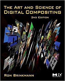
“The art and science of digital compositing techniques for visual effects, animation and motion graphics by Ron Brinkmann”
This book contains a wide range of topics that will aid my work, including an overview of the technical and artistic nature of digital compositing. It covers basic image creation, and looks at the visual cues that are necessary to create a believable composite.
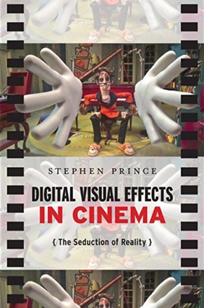
“Digital visual effects in cinema the seduction of reality by Stephen Prince”
This text also looks at the key entities needed to create a realistic composite, comparing largely grossing Hollywood films and discussing ther techniques. Stephen Prince offers a detailed exploration of not only stereoscopic 3D, but also image capture and even lighting technologies, all relevant to my final project.
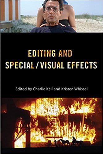
“Editing and special/visual effects/ edited by Charlie Keil and Kristen Whissel”
As well as focusing on other visual effect techniques such as stop motion and split screen cameras, this book traces the development of technologies used in the industry to create CGI and digital visual effects. This read would bode both interesting and educational on this appropriate subject.
Initial Inspirations and Relevant work | Research
GLOAM
“Wandering a dark forest, a solitary creature encounters something unknown with only curiosity to lead the way.”
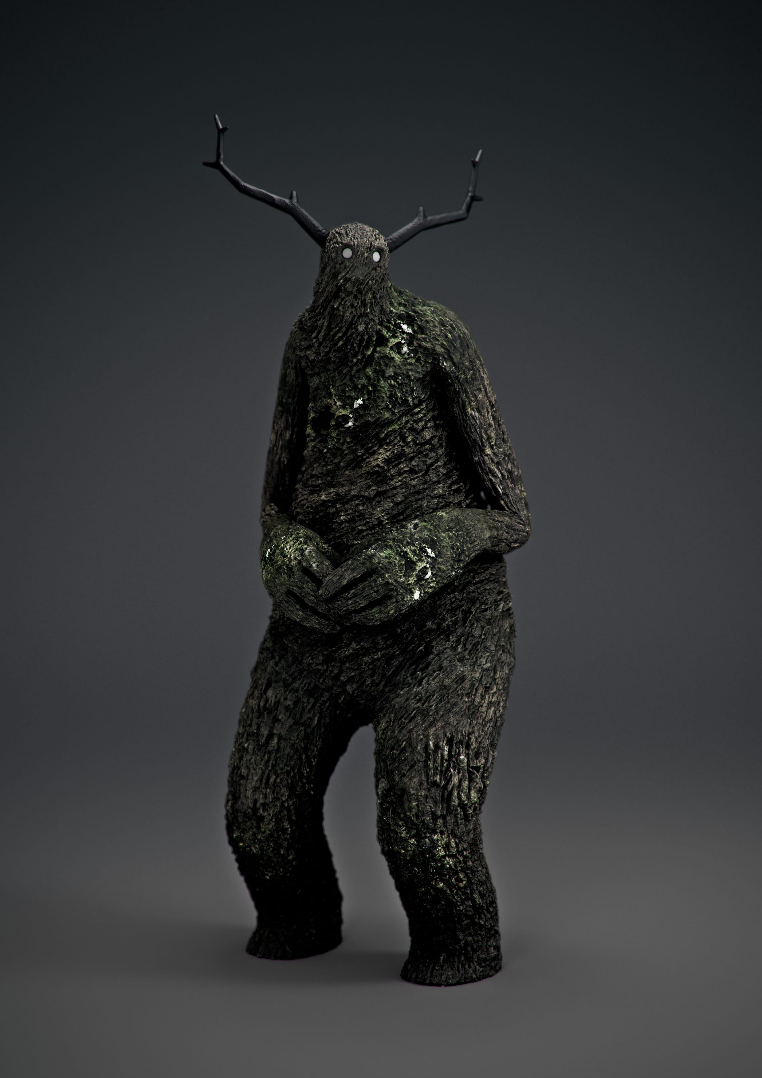
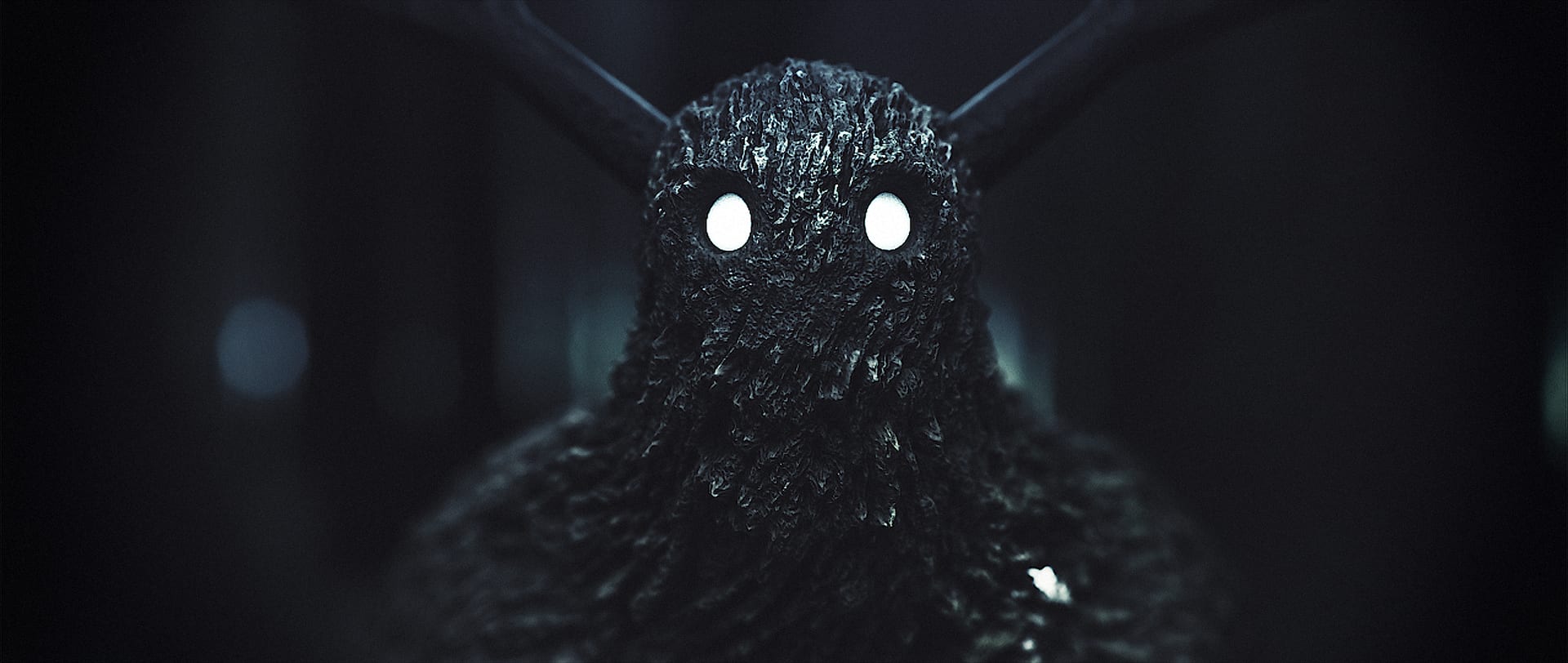
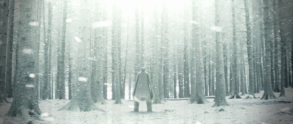
The inspiration for this project came from different parts of the internet, one large influence was the short film “Gloam”, created by David Elwell & Gareth Hughes. This film includes a large character that is wandering the woodland area aimlessly, following small lights that appear to light up a path. The large character appears to be inviting and friendly, with the texture of his skin matching the woodland around him, and his antlers mimicking that of a woodland creature. There is little expression in his face, but the large glowing eyes add to the friendliness of his nature. The proportions of the character are rather disfigured, his hands larger that expected for his body, and his head smaller, much of the detail on this design is reliant on the surface of his skin, rather than the complexity of the 3D model. Despite this, the creature is personified, creating empathy for someone who is only vaguely similar to that of a human.
The film that includes this creature incorporated the surroundings into the design. As mentioned before, this characters skin is extremely similar to the trees it passes and the weather he is surrounded by. This was the initial reason I wanted to create a character that adapts to its surroundings, as creating something that is photorealistic, yet not real, is a challenge in its self. Having the option to choose from different surroundings lead me to decide to create different environments for my creature to manifest in. The final shot of the short film solidified the idea, as throughout the film, this creature was in a glum and dark environment, but the final shot of the floating lights created an almost winter like feel.
The creator of this short film has uploaded a video that includes a detailed breakdown of how the model was first created, and how it was placed in the footage shot for the final film. This gave me an idea on how to begin the design of my character, and how to edit the design into photo’s and/or footage.
REALISTIC POKÉMON
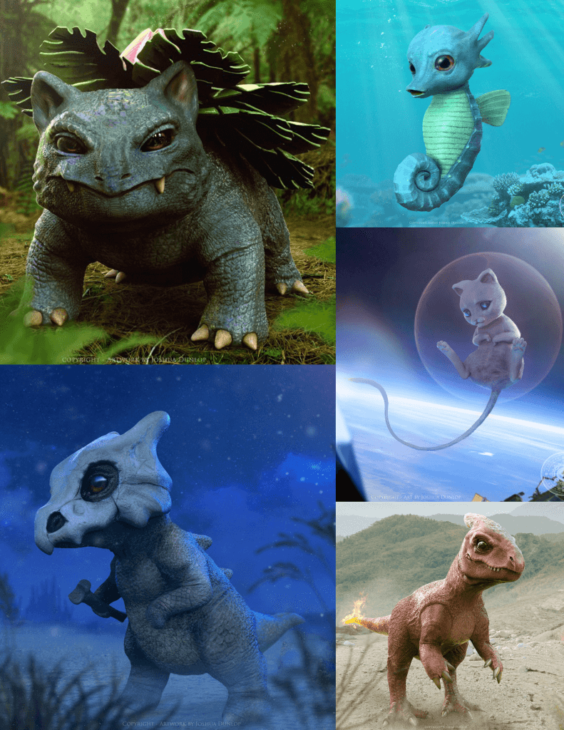
I was also inspired by concept artist Joshua Dunlop’s fan art of the creatures in Pokémon. In this art, Dunlop took some 2D characters and placed them in their appropriate environments, texturing their skin and bringing them to life. He has a selection of examples, but the following images are the ones that inspired me to choose specific backdrops for my one character to adapt to.
The Pokémon franchise splits their characters into many different categories, a.k.a. ‘types’, some of which are based on the elements of weather and climate. These include:
– Fire
– Water
– Ground, Grass & Rock
– Air (Flying)
– Ice
Each pokémon placed in these environments are hindered by opposing, for example, Fire types are weak against Water type, and they have powers that reflect the category they are in. Taking both this information and the way the pokémon are depicted, Dunlop created them realistically and placed them in an appropriate environment.
Semester A Project Outline
The aim of this semester A project is to attract employment as a CG generalist. As a vehicle in which to do this, I am going to create a 1 minute and 20 second proof of concept trailer that uses all my CG generalist skills. As a thematic drive for the project, I am going to design and create a fantasy creature that can evolve and blend into its surroundings and place them in different environments. The reason for this environmental change is to celebrate and motivate different texture painting tech and 3D modelling workflows to help signify narrative change.
I will be designing a mythological creature from scratch, creating the design in a 3D modelling software and altering its textures and pigments. The theme of this project will enable me to extract as much as I can from appropriate software, expanding my basic knowledge. The creature will be designed on paper and recreated as a 3D model which can be placed into different environments, these environments may include a desert, a woodland area, underwater, or even outer space, and each example will be texture painted in isolation from the rest, with the model remaining familiar. The final format of this project will be a 1 minute and 20 second proof of concept trailer. It will include my final designs in photorealistic environments as either images or short clips.
To showcase this brief, I have chosen for it to be assessed under the methodology of assessment strand 2. This strand is almost equally based on the production of a portfolio of work as the final project its self. Because my work will require several experiments before the final outcome can be produced, it seemed appropriate to show the final outcome with trials and errors I face during the production.
I intend to aim this project towards potential employers. My key interest in this industry is split equally into 3D modelling and texture painting, therefore I hope to attract the attention of people within the CG generalist employment spectrum, with people who focus on either the modelling or texture painting of assets separately still seeing my potential.
Having only briefly worked in engines such as Blender and Substance painter, this project will heavily expand my knowledge within both these two softwares and other similar software that may become more appropriate for the project. Not only will my technical skills be tested, but I will need to blueprint both the shape and features of this creature and design different types of appearances, forcing me to think creatively and strive for originality.
